SoSha Logo

Partnership for Public Service

Cost to Your Community

Help us reach as many people as possible.

Share these posts and spread the word! 📣

See how federal cuts hurt your district. 📍 @publicservice's The Cost to Your Community map reveals the real impact on personnel, funding and infrastructure. Explore your area and share its story. ➡️
Explore the map ourpublicservice.org

Select social network:
The Partnership for Public Service’s new interactive map, The Cost to Your Community, shows the federal footprint in every congressional district across the nation, combining state and local data with stories of harm and risk caused by federal cuts. From federal funding cuts to medical services and vaccine research, to staffing cuts to national parks and disaster aid, every community across the country has a story to tell about the impact of these cuts. ➡️ Explore the map ➡️ Find your district ➡️ Share your community's story Learn more about stories in your state and contact your member of Congress about the harms happening in your community.
➡️ Explore the map ourpublicservice.org

Select social network:
How do cuts to federal personnel, funding and infrastructure impact you? @publicservice's The Cost to Your Community map shows the government's footprint and impact across the nation. Explore the map to learn what's at risk in your community.
Explore the map ourpublicservice.org

Select social network:
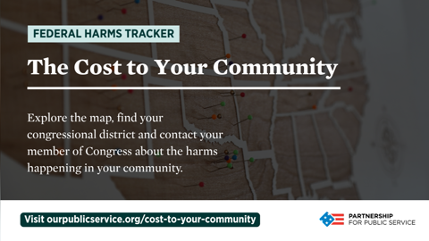
The Partnership for Public Service’s Federal Harms Tracker product, The Cost to Your Community, shows how federal institutions and activities are woven into the fabric of almost every community across the country. The interactive map combines state and congressional-district level data and impact stories to provide a layered view of how government resources are distributed around the country and how that presence is shifting under the Trump administration. These stories reveal how the erosion of federal institutions is affecting communities in real and everyday ways. Share what you find in The Cost to Your Community and to help shine a light on the very real consequences of weakened federal capacity.
Explore the map ourpublicservice.org

Select social network:
Just launched: @publicservice's The Cost to Your Community, an interactive map that shows how government resources are distributed nationally and what's at risk when federal cuts happen. Explore the map and share the harms happening in your community.
Explore the map ourpublicservice.org

Select social network:
How do cuts to federal personnel, funding and infrastructure impact you? The Partnership for Public Service’s latest Federal Harms Tracker product, The Cost to Your Community, is designed to show the federal government’s footprint and impact across the nation. This interactive map combines state- and congressional district-level data and impact stories that highlight the effect federal cuts have on individuals, communities and organizations. Explore your district and share what you find to show what’s happening to communities across America.
Explore the map ourpublicservice.org

Select social network: